b. From smart icon bar, click on bar graph icon ![]() or choose
or choose
LAB #8
CSC 101
Introduction to Spreadsheets
R Mohammadi
November 1998
Objectives:
Learn about graphing tools offered by Microsoft Excel.
Learn more about functions and addressing in spreadsheets.
about this lab ...
You will need your 3.5" disk for this lab and you must have completed lab#7 and already have a lab7 file on your disk.
1. Create a basic graph for first quarter.
a. In the Total column for the First Quarter , highlight totals for clothing, toys, housewares, and jewelry.
b. From smart icon bar, click on bar graph icon ![]() or choose
or choose
2. Using the Graph Wizard.
A wonderful feature of Microsoft Excel is the Wizard. A wizard provides assistance in creating charts, graph, tables, etc... For this lab we will use the chart wizard.
a) Select
Column; click next.b) If you highlighted the cells correctly in 4c) the range reads =Sheet1!$F$5:$F$8, or whatever the
correct range for your column is.
c) Select the
Series folder.
d) Fill in
Q1 for name.e) Click on the
x-axis label box.f) On the Spreadsheet, highlight the labels clothing, toys, housewares, and jewelry and hit the Enter key. Click
i)
You want the graph in the spreadsheet, so click Finish.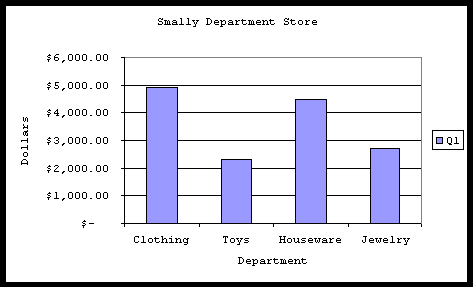
3. Formatting the Graph
a) Click the
right mouse button on the white space inside the graph.b) Click on
Format Chart Area.c) In the Font folder, Change the size to 8 and change the font to courier new.
d) Hit Enter
e) We also want to change the background of the graph from gray to white.
A) On the
Chart tool bar, in the area where it says chart area, click on the down arrow.B) Click on
Plot Area. C) Click on ![]() (This brings you to the Format Plot Area screen).
(This brings you to the Format Plot Area screen).
D) Change the color to white. Click on OK.
f) Click on the chart tool bar and drag it to the top of the screen. Notice how it incorporates itself into the
existing toolbar.
g)
Point to the white space in the chart and drag it by pressing the left mouse button. Place the chart on the right side of the first quarter table.
4. Print Preview via ![]()
5. Create a more complex table.
Here you will create a table that keeps track of the changes from each quarter to the next for each of the departments in the Summary table. To get the difference between quarters, you need to subtract the earlier quarter from the next. For instance in the worksheet below,
|
Smally Department Store |
|||
|
Percentage of Change |
|||
|
Dept. |
Q1 to Q2 |
Q2 to Q3 |
Q3 to Q4 |
|
Clothing |
|||
|
Change Amount |
$ 350.00 |
$ (2,625.00) |
$ 5,250.00 |
|
Change % |
7% |
-50% |
200% |
|
Toys |
|||
|
Change Amount |
$ (25.00) |
$ (1,137.50) |
$ 2,275.00 |
|
Change % |
-1% |
-50% |
200% |
|
Housewares |
|||
|
Change Amount |
$ 350.00 |
$ (2,425.00) |
$ 4,850.00 |
|
Change % |
8% |
-50% |
200% |
|
Jewelry |
|||
|
Change Amount |
$ 50.00 |
$ (1,375.00) |
$ 2,750.00 |
|
Change % |
2% |
-50% |
200% |
6. Print preview via ![]() .
.
7. Save your spreadsheet.
Save this sheet as LAB8 on your 3 ½" Floppy (A:). You have now completed the lab. Logout of the workstation after your lab instructor examines your work.